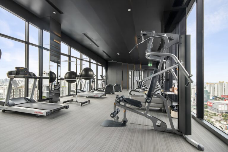
Designing your logo is important; it represents your business’s visual identity and showcases your brand’s essence. Maintaining high quality on your logo design and utilizing unique design elements and attractive visuals that attract your target audience is fundamental to succeeding in your new design.
This article aims to explore logo design trends for fitness brands; we will delve into the best practices and strategies to create an outstanding design and how this can help improve your brand image and visibility.

Brand Questionnaire
Designing Your Fitness Logo
Design trends in logo creation undergo constant evolution, influenced by various factors such as cultural shifts, innovative design techniques, and emerging visual styles. One notable trend involves simplicity and minimalism. Clean, uncluttered designs that convey a brand’s essence using fewer elements and cleaner typography have gained prominence.
As brands adapt to various digital platforms, responsive logos that adjust to different screen sizes and formats become essential. These adaptable logos ensure consistency in brand representation across diverse mediums, from mobile apps to social media profiles, enabling brands to maintain a cohesive identity in the digital landscape.
The role of a logo in a brand’s identity is multifaceted and integral to its recognition, differentiation, and communication. A logo serves as the visual cornerstone of a brand, encapsulating its essence, values, and personality into a single symbol or mark. It acts as a powerful identifier, instantly connecting consumers to the brand and forming the foundation of its visual identity.
It becomes the face of the brand, appearing across various touchpoints, from products and packaging to marketing materials and digital platforms. A well-crafted logo fosters instant recognition, triggering associations with the brand’s products, services, and values in the minds of consumers. Consistency in logo application builds familiarity and trust, creating a lasting imprint in the consumer’s memory.
A logo is a communication tool conveying the brand’s message without words. It communicates the brand’s values, industry, and sometimes even its promise to consumers. The design elements within a logo evoke emotions and create an immediate impression, shaping consumers’ initial perception of the brand.
Current Design Trends
What are some of the current design trends for fitness logos? Like everything else, the trends and popularity of the different elements a fitness logo should count on constantly evolve. That is why you need to be updated on what are the design elements that will impulse your brand visual image, like the following:
- Gradient and Vibrant Colors: Utilizing bold and vibrant color palettes, often incorporating gradients, to create visually striking logos that capture attention and evoke emotions.
- Versatile Logo Systems: Developing logo systems that allow for flexibility in design, enabling variations and adaptations while maintaining the brand’s core essence and recognition factor.
- Handcrafted and Custom Lettering: Embracing hand-drawn elements, unique typography, and custom lettering to add a personal, artisanal touch to logos, creating distinct and memorable identities.
- Animated and Dynamic Logos: Designing logos with motion or animation for digital platforms, providing engaging and interactive brand experiences that capture audience attention.
- Geometric and Abstract Shapes: Using geometric patterns and abstract shapes to create modern and innovative logos that convey complexity and depth in a simplistic form.
Utilizing negative space effectively in design is a powerful technique that employs the space around and between objects to create meaningful and clever visual compositions. This technique involves leveraging the empty or unused space within an image or design to convey additional layers of meaning or create optical illusions. One of the key advantages of using negative space is its ability to add depth, nuance, and intrigue to a design without cluttering it with unnecessary elements.
Effective use of negative space in design enhances visual balance and harmony. It allows designers to create a harmonious relationship between the positive elements (the main subjects or shapes) and the negative space surrounding them. This balance enhances the overall aesthetic appeal and directs the viewer’s focus, guiding their attention to the intended focal point.
Minimalism and Simplicity
Minimalist designs prioritize simplicity, stripping away unnecessary elements while retaining a strong and meaningful core. For a fitness logo, this approach often involves using clean lines, basic shapes, and restrained typography to convey the brand’s identity and values concisely yet powerfully.
A minimalist fitness logo aims to evoke a sense of sophistication and modernity while effectively communicating the brand’s message. It could involve minimalist representations of fitness-related elements, such as abstract depictions of a person in motion, streamlined dumbbells, or subtle, geometric shapes that imply movement or strength. These simple yet purposeful elements convey the brand’s association with fitness without overwhelming the design with unnecessary details.
These logos are adaptable, ensuring clarity and readability across various platforms, from digital to print media and even on small-scale applications like app icons or social media avatars. The simplicity of the design allows for easy recognition and recall, enabling the logo to remain effective and impactful regardless of its size or application.
Minimalist design principles offer brands a distinct advantage in creating memorable and recognizable identities. By stripping away unnecessary complexities, minimalist branding focuses on clarity, simplicity, and a refined aesthetic, making it easier for consumers to identify and recall the brand.
Minimalist branding often revolves around clean lines, straightforward typography, and restrained use of colors. This streamlined approach allows the brand’s visual elements to stand out and create a lasting impression. Whether it’s a logo, packaging, or marketing materials, the minimalist design aesthetic enables brands to achieve a cohesive and instantly recognizable look.
Versatility and Adaptability
Fitness brands, often catering to tech-savvy and digitally engaged audiences, benefit immensely from logos designed with responsiveness in mind. These logos are created to seamlessly adjust and maintain visual integrity across various screen sizes, resolutions, and digital mediums, including mobile devices, tablets, websites, and social media platforms.
For fitness brands, the importance of responsive logos lies in maintaining consistency and brand recognition across the diverse digital landscape. Whether displayed on a smartphone screen during a fitness app interaction or prominently on a website, a responsive logo ensures that the brand’s visual identity remains intact, instantly recognizable, and retains its impact regardless of the device or platform on which it’s viewed.
Responsive design in fitness brand logos reflects a commitment to modernity and technological adaptability. It portrays the brand as forward-thinking, tech-friendly, and attuned to the needs of its audience, which often expects a seamless and visually appealing experience across various digital touchpoints.
Brand Questionnaire
Color Psychology Usage
Each color holds unique psychological associations that can significantly impact how individuals perceive a fitness brand and its offerings. In this context, various colors are intentionally selected and incorporated into fitness logos to evoke certain feelings and communicate particular messages. Here are some examples:
RED
Fitness logos often use red to convey energy, passion, and action. It stimulates excitement and motivation, making it popular for brands focused on intensity, power, and high-energy workouts. It’s commonly associated with urgency, encouraging action, and determination among fitness enthusiasts.
Blue
Blue tends to evoke trust, reliability, and calmness. Fitness brands utilizing blue in their logos may aim to create a sense of stability, professionalism, and trustworthiness, particularly in settings like gyms or wellness centers, where a serene and reliable environment is sought after.
Yellow
Yellow is often linked to positivity, optimism, and warmth. Fitness brands incorporating yellow in their logos might aim to portray a cheerful and friendly image, creating an inviting atmosphere that encourages approachability and happiness.
Green
Green is strongly associated with health, nature, and growth. It’s commonly used in fitness logos to signify vitality, freshness, and well-being. Brands focusing on holistic health, organic products, or eco-friendly approaches often opt for green to convey their commitment to wellness and sustainability.
On the other hand, we use typography and iconography as part of your design for your logo’s brand. Typography, the art of arranging type, encompasses selecting, setting, and styling fonts to create visually appealing and communicative text. In design, choosing the right typography is crucial as it not only aids readability but also sets the tone, personality, and mood of the message being conveyed.
Iconography uses symbols, icons, or visual elements representing ideas, concepts, or actions. Icons effectively communicate complex messages or actions in a simplified and universally recognizable form. In design, icons can be used to enhance user experience, navigate information, or convey meaning concisely and quickly understandable.
When appropriately paired, typography and iconography work harmoniously to create visually compelling and cohesive designs. The choice of fonts and icons should complement each other, aligning with the overall design aesthetic and message intent. Consistency in style, size, and visual hierarchy ensures a seamless integration of typography and iconography within a design, enhancing its clarity, readability, and visual appeal.
Work With Us!
Crafting the perfect logo for your business can be a challenging endeavor at times. That’s why, if you desire a personalized experience tailored to your business goals and aimed at creating the ideal logo design, we strongly encourage you to contact us. At Creatitive, we boast an experienced team that will assist you in achieving the perfect logo design that will set your business apart from the competition.